Design System คืออะไร? คู่มือสำหรับ Jr. Frontend Developer
บทนำ
ถ้าคุณเพิ่งเริ่มเป็น Frontend Developer คุณอาจเคยเจอปัญหาเหล่านี้:
- ปุ่มหน้านี้กับหน้าโน้น ทำไมสีไม่เหมือนกัน?
- Designer ส่ง mockup มา แต่ Font ในโปรเจกต์ไม่ตรง
- Senior บอกให้ใช้ “Primary Color” แต่ไม่รู้ว่าคือสีอะไร
- ทุกครั้งที่สร้าง Component ใหม่ ต้องเขียน CSS ใหม่หมด
Design System คือคำตอบของปัญหาเหล่านี้ครับ!
ในบทความนี้ ผมจะอธิบายให้เข้าใจง่ายๆ ว่า Design System คืออะไร มีอะไรบ้าง และทำไมมันถึงสำคัญสำหรับ Frontend Developer
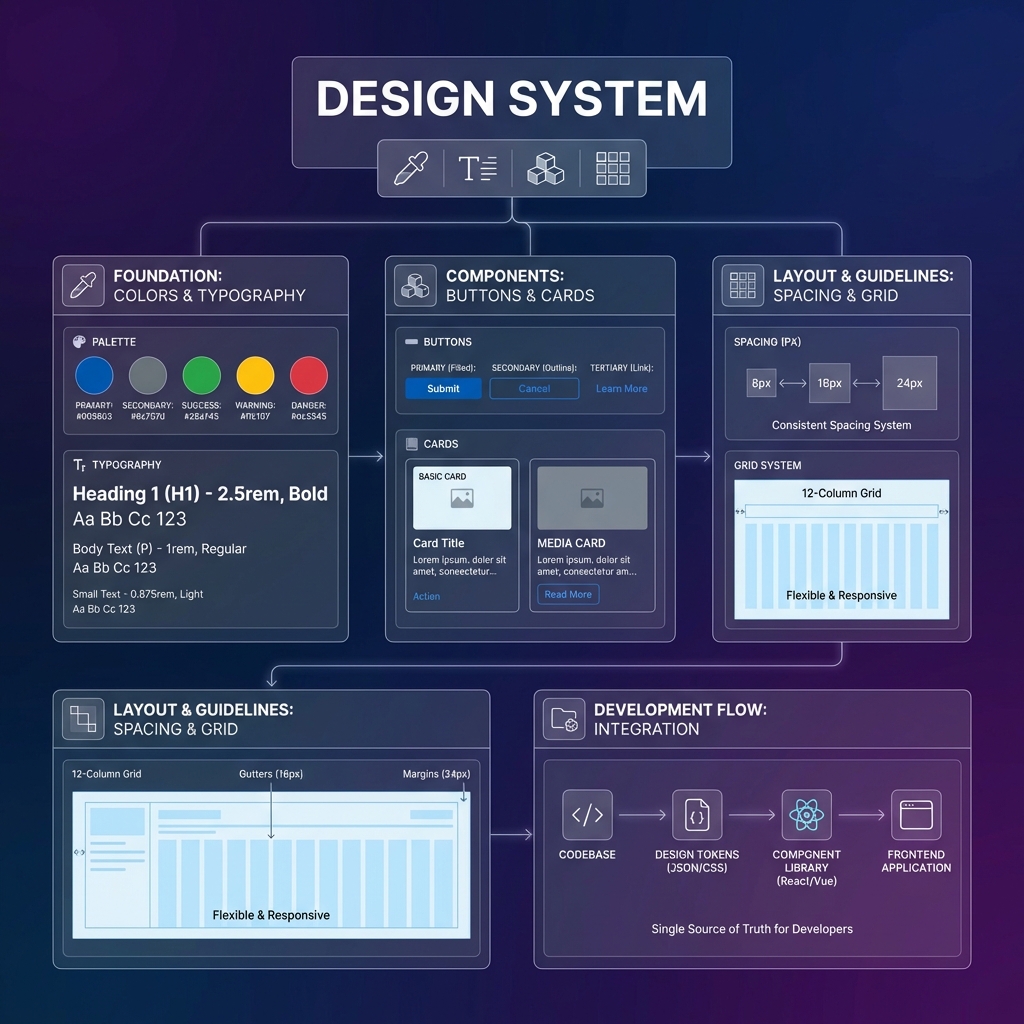
Design System คืออะไร?
Design System คือ “คู่มือ + ชุดเครื่องมือ” ที่รวบรวม:
- กฎเกณฑ์การออกแบบ (Design Guidelines)
- Components สำเร็จรูป (UI Components)
- มาตรฐานการใช้งาน (Documentation)
เปรียบเทียบให้เห็นภาพ
ลองนึกภาพว่าคุณกำลังต่อ LEGO 🧱
| ไม่มี Design System | มี Design System |
|---|---|
| แต่ละคนปั้นชิ้นส่วนเอง | ใช้ชิ้นส่วน LEGO มาตรฐาน |
| ขนาดไม่เท่ากัน ต่อกันไม่ได้ | ขนาดเท่ากัน ต่อกันได้ทุกชิ้น |
| ทำซ้ำยาก | สร้างใหม่ได้เร็ว |
| แต่ละคนทำสไตล์ไม่เหมือนกัน | ทุกคนใช้มาตรฐานเดียวกัน |
Design System = ชุด LEGO สำเร็จรูปของเว็บไซต์/แอป
Design System ประกอบด้วยอะไรบ้าง?
🎨 1. Design Tokens
Design Tokens คือ “ค่าพื้นฐาน” ที่ใช้ซ้ำทั้งระบบ
/* ตัวอย่าง Design Tokens */
:root {
  /* Colors */
  --color-primary: #2563eb;
  --color-secondary: #64748b;
  --color-success: #22c55e;
  --color-error: #ef4444;

  /* Typography */
  --font-family: 'Inter', sans-serif;
  --font-size-sm: 14px;
  --font-size-md: 16px;
  --font-size-lg: 20px;

  /* Spacing */
  --spacing-xs: 4px;
  --spacing-sm: 8px;
  --spacing-md: 16px;
  --spacing-lg: 24px;

  /* Border Radius */
  --radius-sm: 4px;
  --radius-md: 8px;
  --radius-lg: 16px;
}
ทำไมต้องใช้ Tokens?
❌ ไม่ดี:
.button {
  background-color: #2563eb; /* ใส่สีตรงๆ */
}

.header {
  background-color: #2563EB; /* อ๊ะ! พิมพ์ตัวใหญ่ */
}
✅ ดีกว่า:
.button {
  background-color: var(--color-primary);
}

.header {
  background-color: var(--color-primary);
}
💡 ข้อดี: ถ้าวันหนึ่งต้องเปลี่ยนสี Primary แค่แก้ที่เดียว ทุกที่จะเปลี่ยนตาม!
🔤 2. Typography (ระบบตัวอักษร)
กำหนดมาตรฐานสำหรับตัวอักษรทั้งหมด:
/* Heading Styles */
.heading-1 {
  font-family: var(--font-family);
  font-size: 48px;
  font-weight: 700;
  line-height: 1.2;
}

.heading-2 {
  font-family: var(--font-family);
  font-size: 36px;
  font-weight: 600;
  line-height: 1.3;
}

/* Body Text */
.body-text {
  font-family: var(--font-family);
  font-size: 16px;
  font-weight: 400;
  line-height: 1.6;
}

.caption {
  font-family: var(--font-family);
  font-size: 12px;
  font-weight: 400;
  color: var(--color-secondary);
}
ตัวอย่างการใช้งาน:
<h1 class="heading-1">หัวข้อหลัก</h1>
<h2 class="heading-2">หัวข้อรอง</h2>
<p class="body-text">เนื้อหาทั่วไป</p>
<span class="caption">ข้อความเล็กๆ</span>
🎯 3. UI Components
Components คือ ชิ้นส่วน UI สำเร็จรูป ที่สร้างไว้แล้ว พร้อมใช้งาน
Button Component
/* Base Button */
.btn {
  padding: var(--spacing-sm) var(--spacing-md);
  border-radius: var(--radius-md);
  font-family: var(--font-family);
  font-size: var(--font-size-md);
  font-weight: 500;
  cursor: pointer;
  transition: all 0.2s ease;
}

/* Variants */
.btn-primary {
  background-color: var(--color-primary);
  color: white;
  border: none;
}

.btn-primary:hover {
  background-color: var(--color-primary);
  filter: brightness(0.9); /* darker shade */
}

.btn-secondary {
  background-color: transparent;
  color: var(--color-primary);
  border: 1px solid var(--color-primary);
}

.btn-secondary:hover {
  background-color: var(--color-primary);
  color: white;
}

/* Sizes */
.btn-sm {
  padding: var(--spacing-xs) var(--spacing-sm);
  font-size: var(--font-size-sm);
}

.btn-lg {
  padding: var(--spacing-md) var(--spacing-lg);
  font-size: var(--font-size-lg);
}
การใช้งาน:
<!-- Primary Button ขนาดปกติ -->
<button class="btn btn-primary">ยืนยัน</button>

<!-- Secondary Button ขนาดเล็ก -->
<button class="btn btn-secondary btn-sm">ยกเลิก</button>

<!-- Primary Button ขนาดใหญ่ -->
<button class="btn btn-primary btn-lg">สมัครสมาชิก</button>
Card Component
.card {
  background: white;
  border-radius: var(--radius-lg);
  box-shadow: 0 4px 6px rgba(0, 0, 0, 0.1);
  padding: var(--spacing-lg);
}

.card-header {
  margin-bottom: var(--spacing-md);
}

.card-title {
  font-size: var(--font-size-lg);
  font-weight: 600;
  color: var(--color-text, #1a1a1a); /* fallback if token not defined */
}

.card-body {
  color: var(--color-secondary);
  line-height: 1.6;
}

.card-footer {
  margin-top: var(--spacing-lg);
  padding-top: var(--spacing-md);
  border-top: 1px solid #e5e7eb;
}
การใช้งาน:
<div class="card">
  <div class="card-header">
    <h3 class="card-title">หัวข้อการ์ด</h3>
  </div>
  <div class="card-body">
    <p>เนื้อหาในการ์ด อธิบายรายละเอียดต่างๆ</p>
  </div>
  <div class="card-footer">
    <button class="btn btn-primary">ดูเพิ่มเติม</button>
  </div>
</div>
Input Component
.input {
  width: 100%;
  padding: var(--spacing-sm) var(--spacing-md);
  font-family: var(--font-family);
  font-size: var(--font-size-md);
  border: 1px solid #d1d5db;
  border-radius: var(--radius-md);
  transition: border-color 0.2s ease;
}

.input:focus {
  outline: none;
  border-color: var(--color-primary);
  box-shadow: 0 0 0 3px rgba(37, 99, 235, 0.1);
}

.input-error {
  border-color: var(--color-error);
}

.input-label {
  display: block;
  margin-bottom: var(--spacing-xs);
  font-weight: 500;
  color: #374151;
}

.input-helper {
  margin-top: var(--spacing-xs);
  font-size: var(--font-size-sm);
  color: var(--color-secondary);
}

.input-error-message {
  margin-top: var(--spacing-xs);
  font-size: var(--font-size-sm);
  color: var(--color-error);
}
📐 4. Layout System (ระบบ Layout)
กำหนดโครงสร้างหน้าเว็บ:
/* Container */
.container {
  max-width: 1200px;
  margin: 0 auto;
  padding: 0 var(--spacing-md);
}

/* Grid System */
.grid {
  display: grid;
  gap: var(--spacing-md);
}

.grid-cols-2 {
  grid-template-columns: repeat(2, 1fr);
}

.grid-cols-3 {
  grid-template-columns: repeat(3, 1fr);
}

.grid-cols-4 {
  grid-template-columns: repeat(4, 1fr);
}

/* Flexbox Utilities */
.flex {
  display: flex;
}

.flex-center {
  justify-content: center;
  align-items: center;
}

.flex-between {
  justify-content: space-between;
  align-items: center;
}

/* Responsive */
@media (max-width: 768px) {
  .grid-cols-2,
  .grid-cols-3,
  .grid-cols-4 {
    grid-template-columns: 1fr;
  }
}
📖 5. Documentation
Design System ที่ดีต้องมี เอกสารประกอบ ที่ชัดเจน:
สิ่งที่ควรมีใน Documentation:
- วิธีติดตั้ง — npm install หรือ import CSS อย่างไร
- รายการ Components — มีอะไรบ้าง พร้อมตัวอย่าง
- Props/Variants — แต่ละ Component ใช้งานได้กี่แบบ
- Do’s and Don’ts — ควรใช้ / ไม่ควรใช้อย่างไร
- Code Examples — ตัวอย่าง code พร้อม copy
ทำไม Jr. Developer ต้องเข้าใจ Design System?
✅ ข้อดีสำหรับ Developer
| ปัญหา | Design System ช่วยได้อย่างไร |
|---|---|
| ไม่รู้จะใช้สีอะไร | ดู Design Tokens |
| ไม่รู้ spacing เท่าไหร่ | ใช้ spacing variables |
| ต้องเขียน CSS ใหม่ทุกครั้ง | ใช้ Components สำเร็จรูป |
| UI ไม่ consistent | ทุกคนใช้มาตรฐานเดียวกัน |
| Review code ยาก | มี pattern ที่ตกลงกันไว้แล้ว |
🚀 ช่วยให้ทำงานเร็วขึ้น
ก่อนมี Design System:
1. ดู mockup จาก Designer
2. เขียน CSS ใหม่ทั้งหมด
3. ถูก review ว่าสีผิด, spacing ผิด
4. แก้แล้วแก้อีก
5. สุดท้ายก็ไม่เหมือน mockup 100%
หลังมี Design System:
1. ดู mockup จาก Designer
2. ประกอบจาก Components ที่มีอยู่
3. สี, spacing ถูกต้องตั้งแต่แรก
4. Review ผ่านเร็ว
5. ตรงกับ mockup เพราะใช้ของเดียวกัน
ตัวอย่าง Design System ที่ดัง
1. Material Design (Google)
- ใช้กับ Android, Flutter, Web
- มี Guidelines ละเอียดมาก
- material.io
2. Ant Design (Alibaba)
- นิยมใน React projects
- มี Components เยอะมาก
- เหมาะกับ Admin Dashboard
3. Tailwind CSS
- ไม่ใช่ Design System แท้ๆ แต่เป็น Utility-first CSS
- ช่วยให้สร้าง Design System ได้เร็ว
- เหมาะกับ Startup และ Rapid Development
4. Chakra UI
- สำหรับ React
- Accessible by default
- ใช้งานง่าย customize ได้
5. Shadcn/ui
- สำหรับ React/Next.js
- Copy-paste components
- ใช้ Tailwind CSS
วิธีเริ่มต้นใช้ Design System
สำหรับโปรเจกต์ที่มี Design System อยู่แล้ว
- อ่าน Documentation — ศึกษาว่ามีอะไรบ้าง
- ดู Component Library — ลองใช้ใน Storybook หรือ Playground
- ใช้ Tokens ก่อน — อย่าเขียนค่าตรงๆ ใน CSS
- ถามถ้าไม่แน่ใจ — ถาม Designer หรือ Senior
สำหรับโปรเจกต์ใหม่
ขั้นตอนที่ 1: กำหนด Design Tokens
└── Colors, Typography, Spacing

ขั้นตอนที่ 2: สร้าง Base Components
└── Button, Input, Card

ขั้นตอนที่ 3: สร้าง Layout System
└── Container, Grid, Flex utilities

ขั้นตอนที่ 4: เขียน Documentation
└── วิธีใช้, ตัวอย่าง, Do's & Don'ts
Tips สำหรับ Jr. Developer
✅ Do’s
- ✅ ใช้ Design Tokens แทนค่า hard-coded
- ✅ ใช้ Components ที่มีอยู่ก่อน สร้างใหม่เมื่อจำเป็น
- ✅ อ่าน Documentation ก่อนถาม
- ✅ ถ้าต้องสร้าง Component ใหม่ ให้บอก Designer/Senior ก่อน
- ✅ ทำ Consistent กับ Pattern ที่มีอยู่
❌ Don’ts
- ❌ อย่าใส่สีตรงๆ เช่น
color: #2563eb - ❌ อย่าใส่ขนาดตรงๆ เช่น
margin: 17px - ❌ อย่าสร้าง Component ใหม่ถ้ามีอยู่แล้ว
- ❌ อย่าแก้ไข Core Components โดยไม่ได้รับอนุญาต
- ❌ อย่า override styles โดยไม่จำเป็น
สรุป
Design System คือ:
- ชุดกฎเกณฑ์ — สี, ตัวอักษร, spacing
- Components สำเร็จรูป — Button, Card, Input
- Documentation — วิธีใช้งาน
ประโยชน์:
- ทำงานเร็วขึ้น
- UI Consistent ทั้งโปรเจกต์
- Review code ง่ายขึ้น
- ทำงานร่วมกับ Designer ได้ดีขึ้น
สำหรับ Jr. Developer การเข้าใจ Design System ตั้งแต่เนิ่นๆ จะช่วยให้คุณเติบโตเป็น Developer ที่ดีได้เร็วขึ้น เพราะคุณจะเข้าใจทั้ง “ทำอย่างไร” และ “ทำไมต้องทำแบบนี้”
ติดต่อเรา
สนใจพัฒนา Frontend ให้มีระบบมากขึ้น หรือต้องการคำปรึกษาเกี่ยวกับ Design System?
Cloudsoft พร้อมให้บริการออกแบบและพัฒนาระบบซอฟต์แวร์ ด้วยทีมผู้เชี่ยวชาญที่มีประสบการณ์
📞 ติดต่อขอคำปรึกษา หรือสอบถามข้อมูลเพิ่มเติมได้เลยครับ